What Makes a Brand Impossible to Ignore?
Why do some brands stay in our minds even before we see their name? Explore how colour, shape, packaging and experience make brands instantly recognisable—and what students can learn from the design thinking behind them.
What Makes a Brand Impossible to Ignore?
You recognise the bottle before you read the label.
You notice a flash of red beneath a black heel and immediately make the connection.
You see a familiar shape from across the street and already know what is there.
That is when branding becomes fascinating.
Because at some point, the brand no longer needs to keep introducing itself.
Its colours, shapes, packaging, products and personality have started doing the talking.
And that raises an interesting question:
How does design make us remember something so well?
It Is Rarely Just the Logo
When we hear the word branding, the logo is usually the first thing that comes to mind.
But think about the brands you know really well.
You probably remember much more than their logos.
You remember colours. Packaging. Advertisements. Stores. Products. Maybe even a particular sound or the way the brand speaks.
Over time, all of these experiences become connected in our minds.
That is why a brand can sometimes remove its name entirely and still remain recognisable.
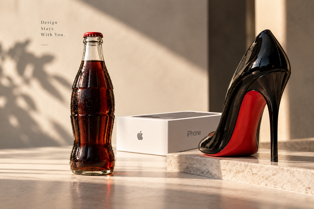
The Coca-Cola bottle is a good example. Its distinctive contour became so closely associated with the brand that the shape itself carries recognition.
Christian Louboutin created another recognisable detail: the red sole.
And with brands such as Apple, even the restrained packaging and product presentation have become part of what people expect from the brand.
Three completely different examples.
But all of them reveal something important:
Design can make even a small detail memorable.
So What Are We Actually Remembering?
This is where branding becomes more interesting than simply making things look attractive.
Imagine two cafés next to each other.
One feels colourful, energetic and young.
The other feels quiet, sophisticated and premium.
Before tasting the coffee, you have already formed an impression.
Something created that impression.
Perhaps it was the sign outside.
The furniture.
The menu.
The colours.
The packaging.
The music.
Or a combination of all of them.
You may not consciously analyse every detail, but together they create a feeling.
And that feeling influences what you expect from the place.
This is where branding and design begin to overlap with human behaviour, communication and experience.
For a student discovering design, that opens up a much bigger world than simply asking whether something “looks good.”
There Is a Lot Happening Behind What Looks Simple
Take a beautifully designed package from a shelf.
At first, the final result might look effortless.
But someone had to decide what it should communicate, who it should appeal to and what would make it stand out from everything sitting beside it.
The same is true of a website, advertisement, visual identity or store.
What we see is the finished result.
What we don’t see is the thinking behind it.
And that invisible part of design is often the most interesting.
Why this colour?
Why this shape?
Why does one brand feel playful while another feels serious?
Why does one package immediately catch your attention?
Why do certain brands remain recognisable even when their logo is not visible?
These are not questions with one simple answer.
They are the kinds of questions designers learn to investigate.

This Is What We Want Students to Discover at Studio Atelier
At Studio Atelier, we believe design education should help students look beyond the finished outcome and become curious about the thinking behind it.
Branding is one way students begin exploring how design influences communication, perception and experience.
Through guided projects, experimentation and feedback, they can go deeper into why certain visual decisions work—and how different choices change the way an idea is understood.
Because noticing good design is the beginning.
Learning how to create it is the next step.
You Can Start Noticing Today
The next time you come across a brand you recognise instantly, notice what caught your attention first.
Was it the name?
Or was it a colour, shape, package, photograph or something harder to explain?
Once you begin looking for these signals, branding becomes surprisingly difficult to stop noticing.
A coffee cup is no longer just a cup.
A shoebox is no longer just a box.
A bottle is no longer simply a container.
They all become part of how an idea is remembered.
And for someone exploring branding, graphic design or communication design, that curiosity is a great place to start.
Because perhaps the more interesting question is not:
“Do I like this brand?”
It is:
“What did the designer do to make me feel this way?”
 ▶
▶
What makes a brand impossible to ignore?
See how colour, shape, packaging and visual details can make a brand memorable even before we read its name.
Watch on Instagram →